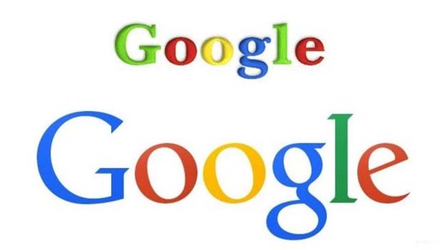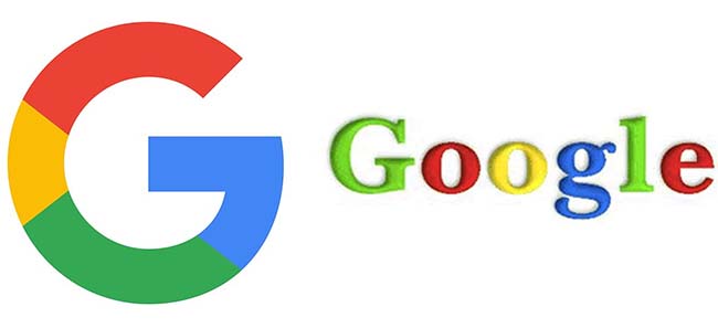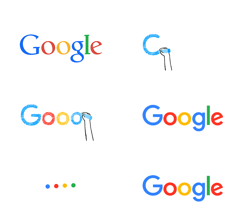


Google, just after the corporate reorganization and setting up its name to Alphabet, fascinating the new CEO and lugging on new things, has finally come up to its mark to put on. Today, the company has unveiled the official changed logo, which will now represent the brand Google. The four color quad rainbow logo 'G' represents the new face of the company.

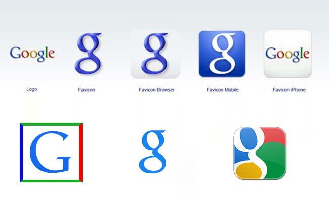
The logo has not only launched for browsers but also for mobile devices to feature. Apart from redesigning the full logo, Google marked up the bench by changing its so called symbol 'g' of blue color to 'G' of four color flag. The font flashes sans-serif typeface which is similar to that of the new holding company of Google, as Alphabet.


The new banner epitomized over the older has already been taken place on the Search bar or Search Home Page. The fifth number logo, so far designed is fully uncluttered and clear to dignify the brand name with the favorite four color of the biggest search engine. Google took place in 1998, since then the logos are only renovated five times for the users to lure.
The mountainous firm, in a blog post said, "the logo will be visible in various forms across devices and interfaces, such as a new four-color mic symbol (seen below) and a four-dot loading symbol". Along with this, "the new brand identity aims to make Google more accessible and useful to our users, adding that it has taken the 'best of Google' - simple, uncluttered, colourful, friendly and embodied it in the logo". The new logo has come, three months after the separation of the subsidiary firms with the new corporate firm, called Alphabet. The main focus is to separate out the subsidiary business with the newer ventures like driver-less car (self-driving car), to separate out the core Web advertising business.
Source: ndtv.com